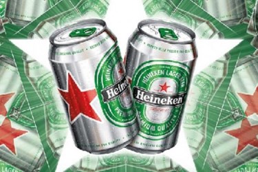
Heineken Rolls Out New Cans To Attract Modern Consumers
By Isaac Fletcher, contributing writer, Food Online

In an effort to up the appeal of its product to contemporary, city-dwelling men, the beer-maker is introducing a fresh redesign of its cans
Heineken’s new “Star Can” tones down the brand’s trademark green in order to put greater emphasis on the aluminum, while enhancing other features. The can is being introduced to the 170 countries where Heineken is sold, with some markets beginning sales ahead of the important summer season. This redesign follows the redesign of Heineken bottles, which occurred last year, and appears on all can sizes. The new image was created by the Dutch consultancy DBOD, and is the first update in five years. The design is intended to highlight the can’s aluminum elements in order to create a more masculine look.
Heineken’s manager of global design and concept, Mark van Iterson, explains, “Bare aluminum looks fresh and thirst-quenching when you take the can out of the fridge.” During the redesign, it was crucial to keep the brand easily recognizable, and with the toning down of the easily recognizable green, other features needed to be made more prominent. Van Iterson elaborates, “The red star is one of Heineken’s most important visual symbols and has always been part of the brand identity. We’ve made it larger and more visible so it really stands out to consumers.” Alongside the other changes, Heineken has also replaced the white center of the green logo to make the logo more in line with the rest of the can.
How To Ensure Your Beverage Package Quality
Alcohol experts argue that can design is becoming ever more important, and cite manufacturing advancements for preventing canned beer from tasting metallic. This trend is particularly prevalent in the U.S. where both big and small brewers have pushed can redesigns to improve taste, enhance functionality, and increase brand appeal. Heineken hopes the move will set the product apart from others on the shelves of marketplaces worldwide.
Placing an emphasis on the importance of packaging design in grabbing and holding consumers’ interest, van Iterson states, “Design generally is crucial for most products as it creates appeal for consumers. I believe that design is the premium-ness of this era. When it comes to packaging, the design is also the most tangible point of contact between a brand and consumers — they can literally feel it.”
